Why Your Scandi-Boho Living Room Feels Flat (And How Vintage Fixes It)
I walked into a friend's new flat last month and immediately felt like I'd seen it before.
Not her specifically—I'd seen it, this exact room, about forty-seven times on Instagram that week. Bleached oak flooring. A fiddle-leaf fig that was already looking a bit sorry for itself. Macramé wall hanging, obviously. Rattan pendant light. The requisite beige sectional that cost more than my first car.
"It's very... serene," I said, which is what you say when you can't think of anything else.
She sighed. "I know. It's a bit soulless, isn't it?"
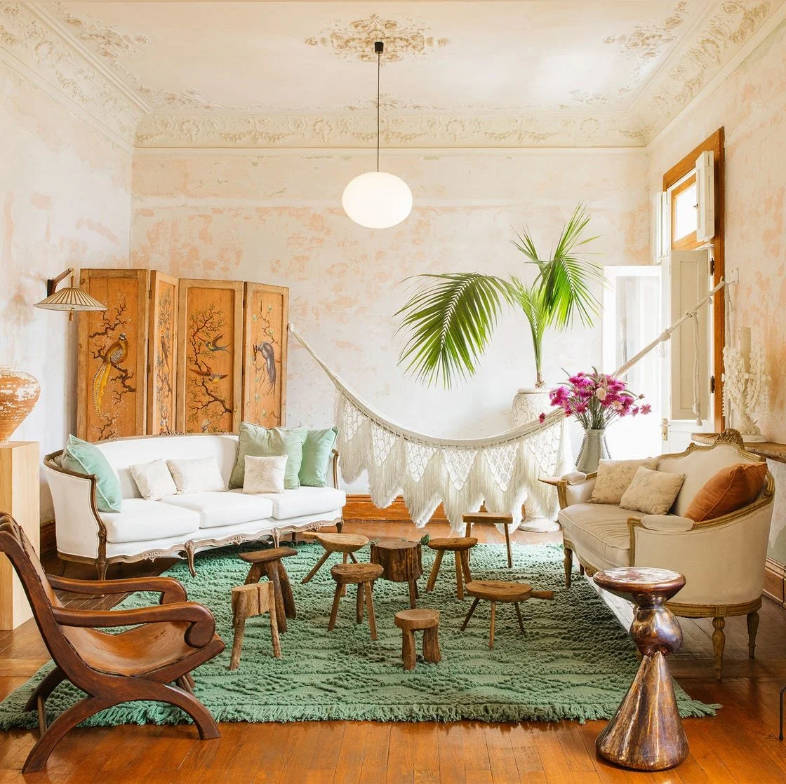
Here's the thing. The Scandi-Boho look—when done well—is genuinely lovely. Light, airy, relaxed, connected to nature. But somewhere between the Pinterest board and the high street, it became a formula. And formulas, by definition, lack the irregularities that make a space feel lived-in rather than staged.
The good news? You don't need to start again. You just need to disrupt the pattern slightly. And vintage pieces are the perfect disruptors.
The Catalogue Conundrum
We've all done it. You see a room you love online, identify the elements, then buy those elements from the most accessible sources. The result is a space that looks "correct" but feels hollow. It's the interior design equivalent of a cover version—technically proficient, but missing the original spark.
The Scandi-Boho formula typically includes:
• Light wood tones (oak, ash, bamboo)
• Natural fibres (jute, linen, cotton)
• Neutral colour palettes (white, cream, beige, soft grey)
• Organic shapes and textures
• Plants, ceramics, woven details
None of this is wrong. It's just incomplete. What you're missing is the history—the sense that objects have been gathered over time rather than purchased in a single afternoon at a certain Swedish furniture giant.
Why Vintage Changes Everything
A vintage piece introduces three things that new furniture struggles to replicate: patina, provenance, and personality.
Patina is the physical evidence of time—the water ring on a sideboard where someone once placed a vase, the slight fade on a chair arm where the sun hit it every afternoon for thirty years. These marks tell you this object has survived. It's resilient. It has stories.
Provenance is the sense that this piece came from somewhere. Maybe a 1970s Danish dining table that hosted family dinners for decades. Perhaps a 1960s ceramic lamp from a pottery in Cornwall. Real places, real makers, real lives.
Personality is the hardest to define but easiest to spot. It's the irregularity of hand-thrown pottery versus machine-made ceramics. The slight asymmetry of a hand-woven textile. The colour variation in aged wood. These "imperfections" are what make a room feel human rather than corporate.
Specific Fixes for Common Flat-Spots
The Beige Sofa Situation
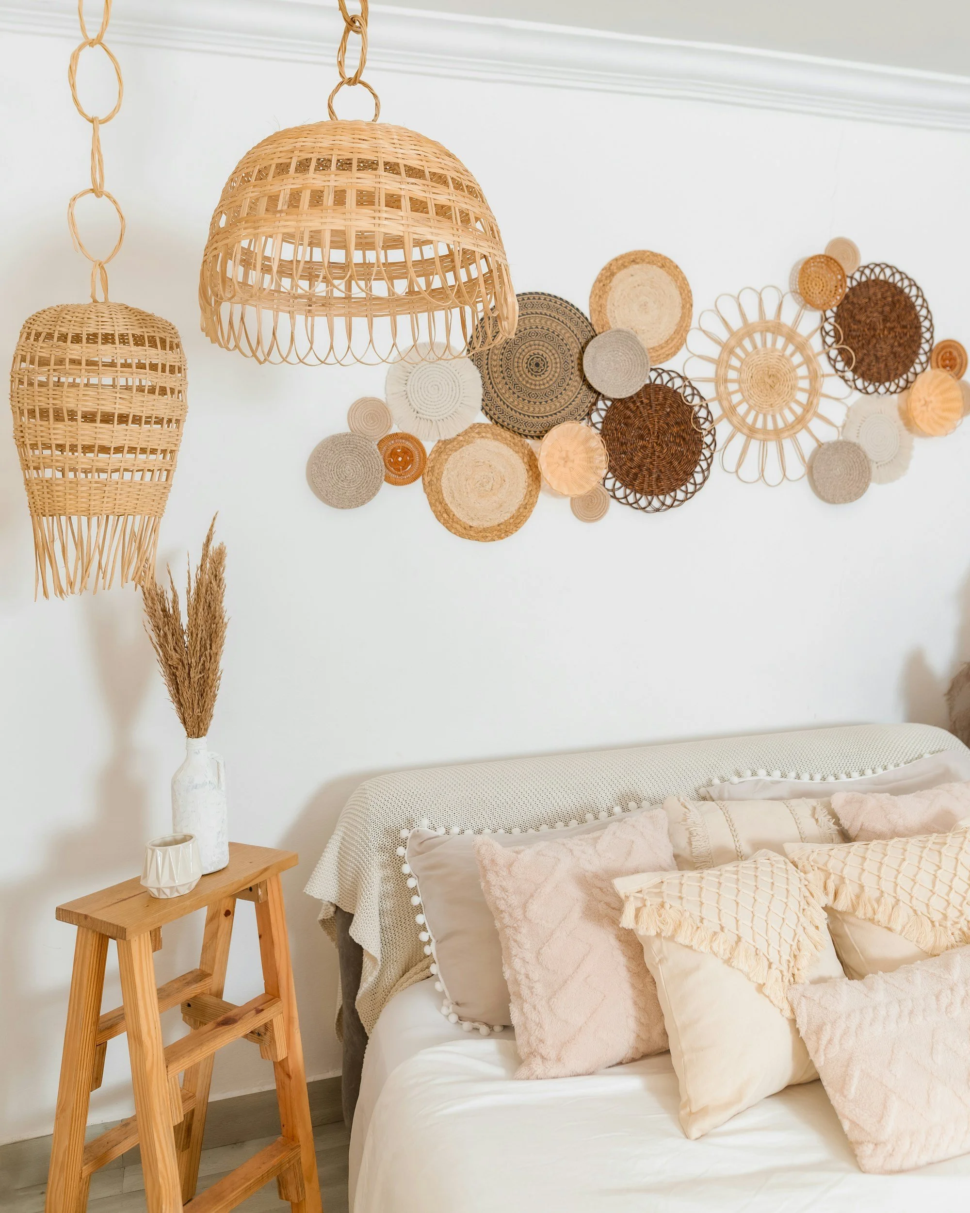
You've got the right idea with natural tones, but everything's reading as "rental flat waiting for personality." Instead of buying new cushions, find a vintage textile.
Look for:
• 1970s woven wool blankets from the Hebrides or Scandinavia—often available for £20-40 at vintage fairs
• Turkish or Persian kelim cushions with geometric patterns (the worn ones are better; they won't look too precious)
• Vintage linen from French flea markets—soft, slubby, imperfect
Drape rather than arrange. The blanket goes over the sofa arm, not folded neatly on the back. The cushions sit at angles that suggest someone actually uses them.
The Floating Furniture Problem
Everything's on legs. The sofa, the armchair, the media unit, the coffee table. It's all hovering six inches off the floor, creating a visual rhythm that's too consistent. You need something grounded.
Find a vintage piece that sits directly on the floor:
• A low 1970s rosewood cabinet (Danish or British)
• A vintage leather pouffe, worn soft and dark
• An antique brass trunk or chest used as a coffee table
The contrast in height and visual weight breaks the monotony. Suddenly the room has topography.
The "Everything's From 2023" Look
Even "vintage-style" new furniture has a sameness. The distressing is uniform. The colours are too consistent. Mix in one piece that's genuinely old—really old—and everything else looks more intentional.
Try:
• A Victorian mahogany side table next to your modern sofa
• A 1950s G-Plan mirror above a contemporary console
• An antique brass floor lamp with a linen shade
The juxtaposition makes both pieces look better. The modern stuff looks curated rather than bought in a rush; the vintage piece looks relevant rather than dusty.
The Art of Intentional Clash
Scandi-Boho relies on harmony—everything in dialogue, nothing jarring. But complete harmony is boring. You need a note of discord to make the harmony meaningful.
Texture clashes that work:
• Sleek mid-century teak against rough, hand-woven textiles
• Shiny vintage brass against matte, chalky ceramics
• Smooth leather (vintage, worn) against nubby bouclé or raw silk
Era clashes that work:
• 1960s Danish minimalism with 1920s Art Deco glamour (try a sunburst mirror)
• 1970s bohemian rattan with Victorian mahogany formality
• Industrial 1950s factory lighting with soft, organic 1970s shapes
The key is confidence. If you place that Victorian table like you mean it, like it absolutely belongs there, it will. Hesitation reads as mistake; certainty reads as style.
Colour Through Vintage
The Scandi-Boho palette can feel washed out because everything's competing to be inoffensive. Vintage pieces often bring colours that are difficult to find in contemporary furniture—colours that have aged and softened in particular ways.
Muddy ochres and mustards from 1970s ceramics and textiles. Not the bright, aggressive yellow of modern trends, but something deeper, more complex.
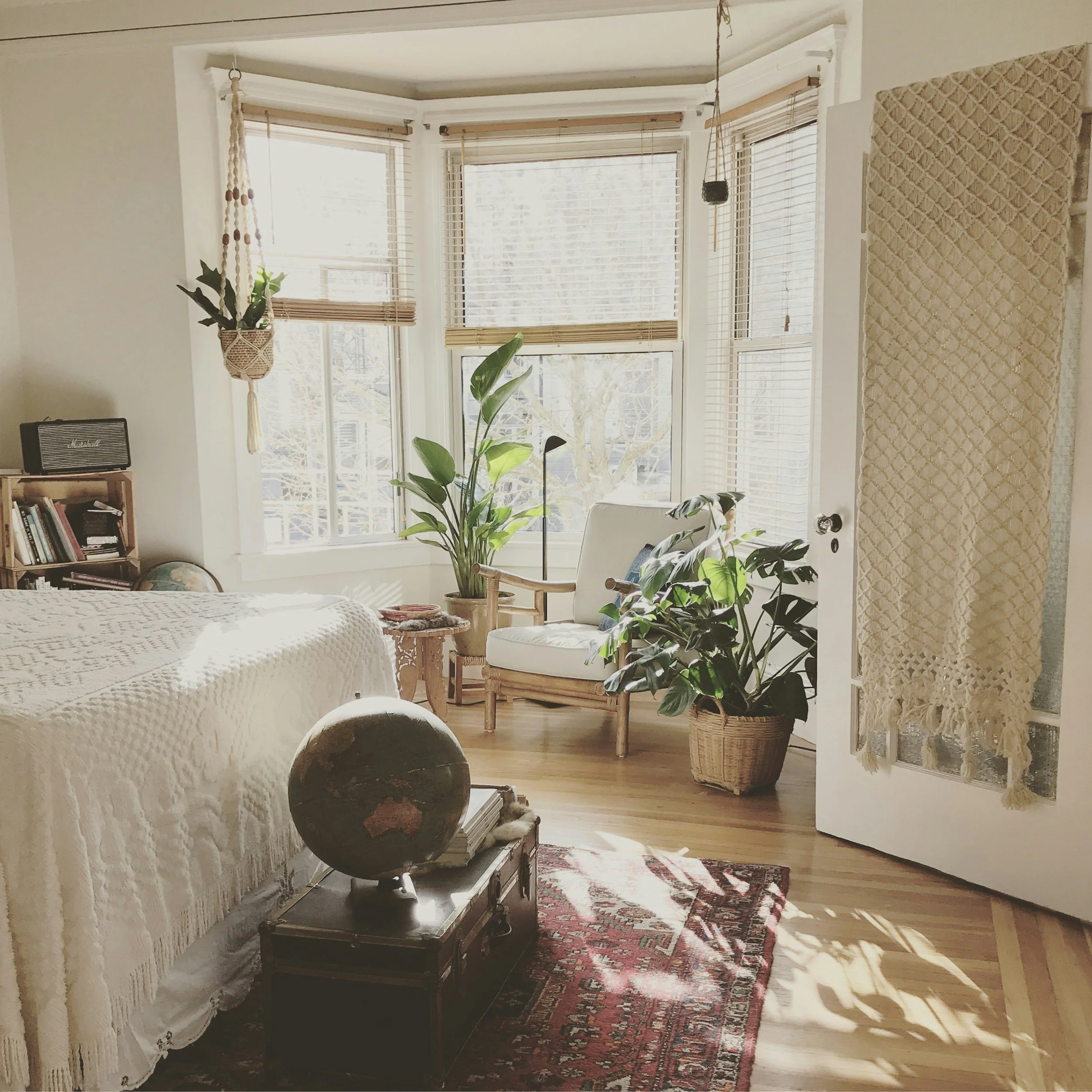
Faded terracottas and rusts from aged leather, old copper, vintage kilims. Colours that suggest sun and time.
Inky blues and greens from Victorian transferware, 1960s glass, Art Deco ceramics. Saturated but not artificial.
Introduce these through small vintage pieces rather than painting walls or buying new coloured furniture. A collection of three vintage vases in varying shades of rust and ochre on a shelf. A 1960s amber glass pendant light. A worn leather club chair in cognac rather than tan.
The "Collected Over Time" Trick
The ultimate goal is a room that looks assembled gradually rather than purchased instantly. Even if you're starting from scratch, you can fake this timeline.
The method:
Start with your base—your modern Scandi-Boho staples. Then add one vintage piece per month. Don't rush. Live with each addition for a few weeks before adding the next. Notice how the room changes, what it asks for.
Month one: the vintage leather pouffe.
Month two: the 1970s ceramic lamp.
Month three: the antique mirror.
Month four: the woven wall hanging (actual vintage, not reproduction).
By month six, you have a room that looks like it evolved naturally. Because it did.
What to Hunt For
If you're starting your vintage collection specifically to animate a Scandi-Boho base, prioritise:
One substantial wooden piece
A sideboard, cabinet, or dining table from the 1960s or 70s. Teak is the obvious choice, but don't overlook afromosia, rosewood, or even good-quality oak. The wood tone should be warmer and deeper than your existing furniture.
One textural element
Woven, worn, irregular. A vintage Berber rug (even a small one layered over a larger natural fibre rug). A hand-thrown ceramic collection. A macramé piece from the 1970s—yes, really, the real thing has a looseness that reproductions lack.
One metallic accent
Brass, copper, or bronze, aged naturally. Not the brushed, sealed brass of contemporary lighting, but something that's lived a bit. A floor lamp, a mirror frame, a collection of candlesticks.
One "wrong" thing
Something that shouldn't work but does. A Victorian oil painting in a modern frame. A 1950s ceramic panther (they're ridiculous and wonderful). An oversized 1970s rattan peacock chair that dominates the corner.
The Reality Check
Your room doesn't need to be a museum. It doesn't need to be "finished." The best spaces are slightly unresolved, still open to possibility. That empty corner where you haven't found the right thing yet? That's not a failure. That's potential.
And please, don't keep anything "for best." Use the vintage pieces daily. Put your coffee mug on the 1970s sideboard. Let the leather chair get more worn. The patina you're adding is your own contribution to the object's history.
My friend with the beige flat? She found a 1960s Danish teak cabinet on Facebook Marketplace for £40. It needed oiling and the handles were wrong, but the bones were perfect. She replaced the handles with simple brass ones from a hardware shop, spent an afternoon with some teak oil and fine steel wool, and placed it against that beige wall.
The room transformed. Not because the cabinet was expensive or rare, but because it was real. It had weight and history and presence. Everything else suddenly looked like it had been chosen to complement something interesting, rather than assembled from a checklist.
That's the vintage difference. It's not about period perfection or investment value. It's about introducing objects that have already lived, that carry their history openly, that refuse to be merely functional.
Your Scandi-Boho base is fine. It's a good foundation. But foundations are meant to be built upon. Start hunting. Start collecting. Start living with things that remind you that design is a conversation across decades, not just a single season's shopping list.
Struggling to find the right piece? Our latest arrivals include a carefully edited selection of vintage furniture that plays well with modern interiors. No reproductions, no "vintage-style"—just honest, well-made pieces looking for their next chapter.